It began with a vision: to strengthen LEGO’s visual expression across its diverse brand ecosystem—creating a unified identity that seamlessly connects physical, digital, and entertainment experiences. The LEGO Group teamed up with Interbrand to create a new, flexible, Visual Identity. I was part of the in-house core team that drove this project to fruition.
Reaching 130+ countries, the LEGO brand has become a universal icon of creativity and play—inviting wonder and exploration for generations. Our mission was to craft a more cohesive and immersive design experience—one that carries the same resonance the brand has built over its 90-year history of play.
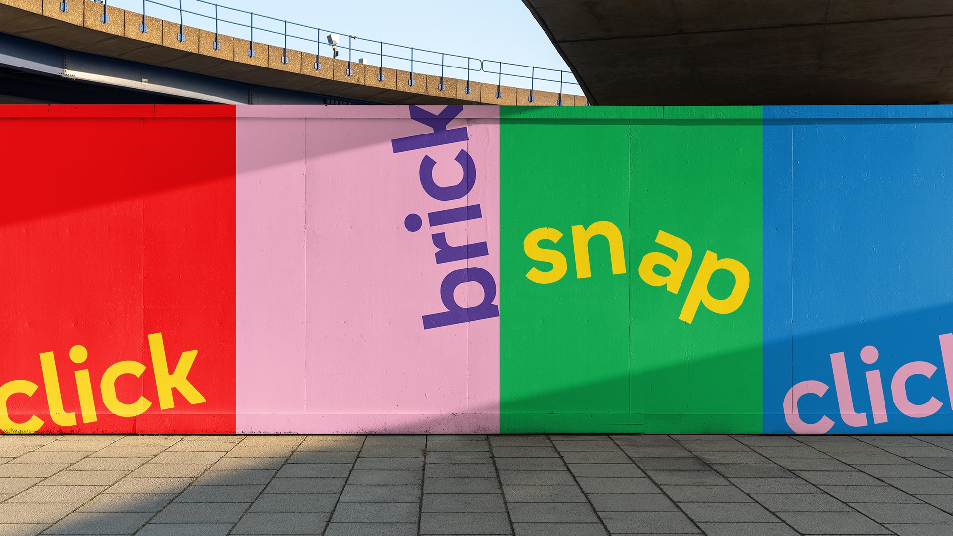
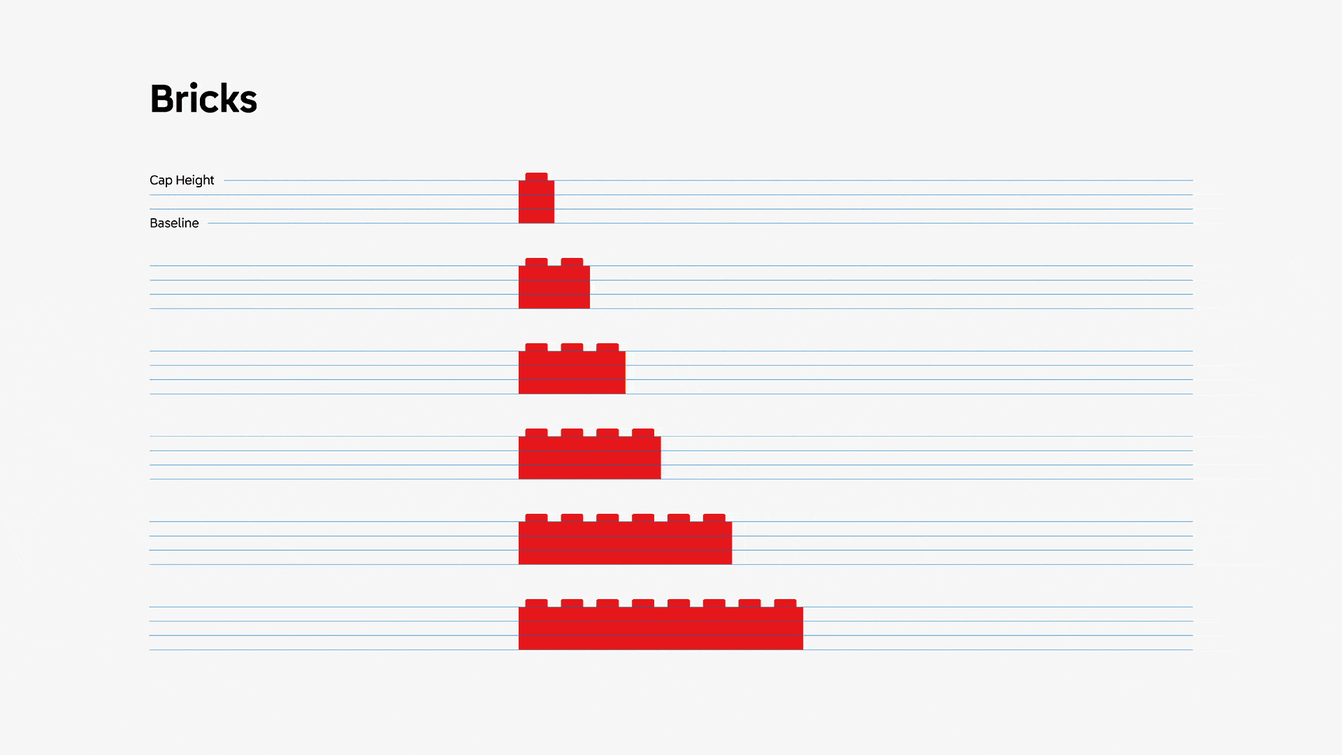
The LEGO System-in-Play empowers kids and adults to build and rebuild, with the endless possibility of creativity. The core of this system? The iconic LEGO brick.
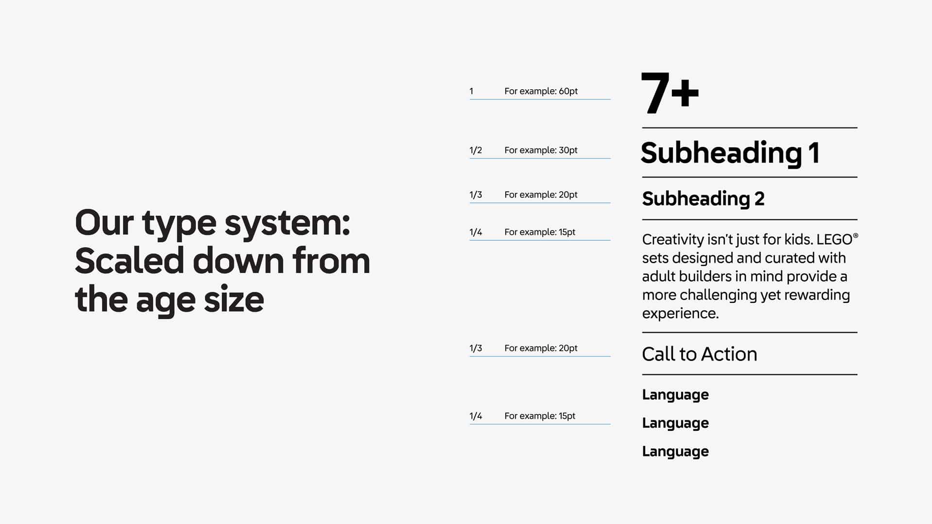
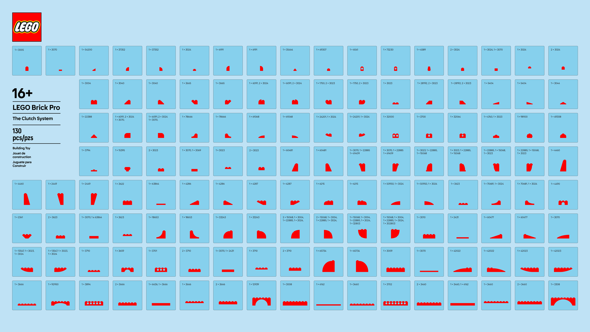
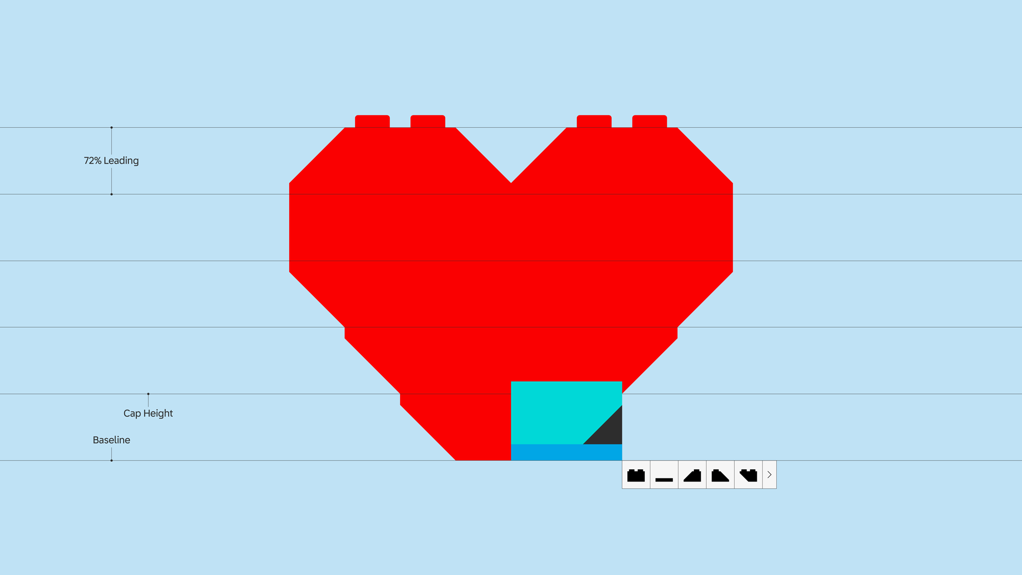
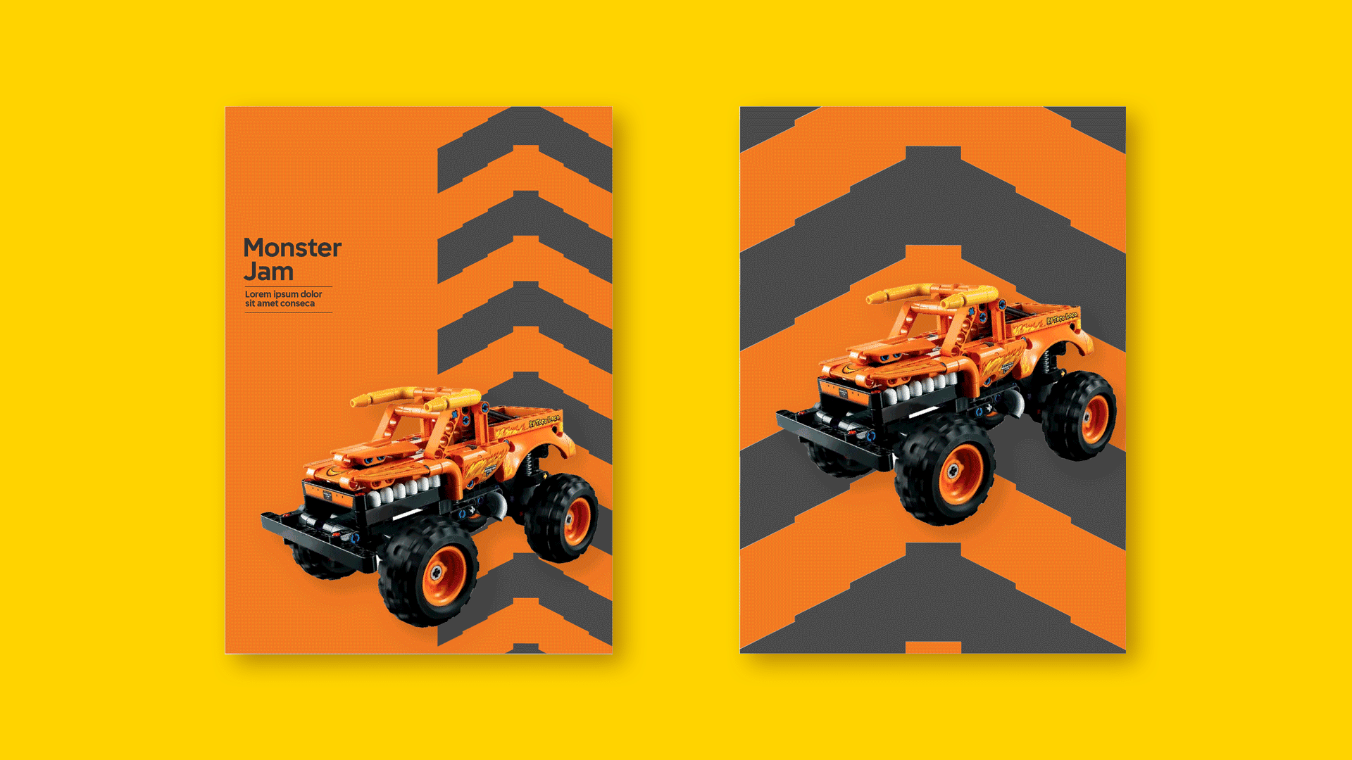
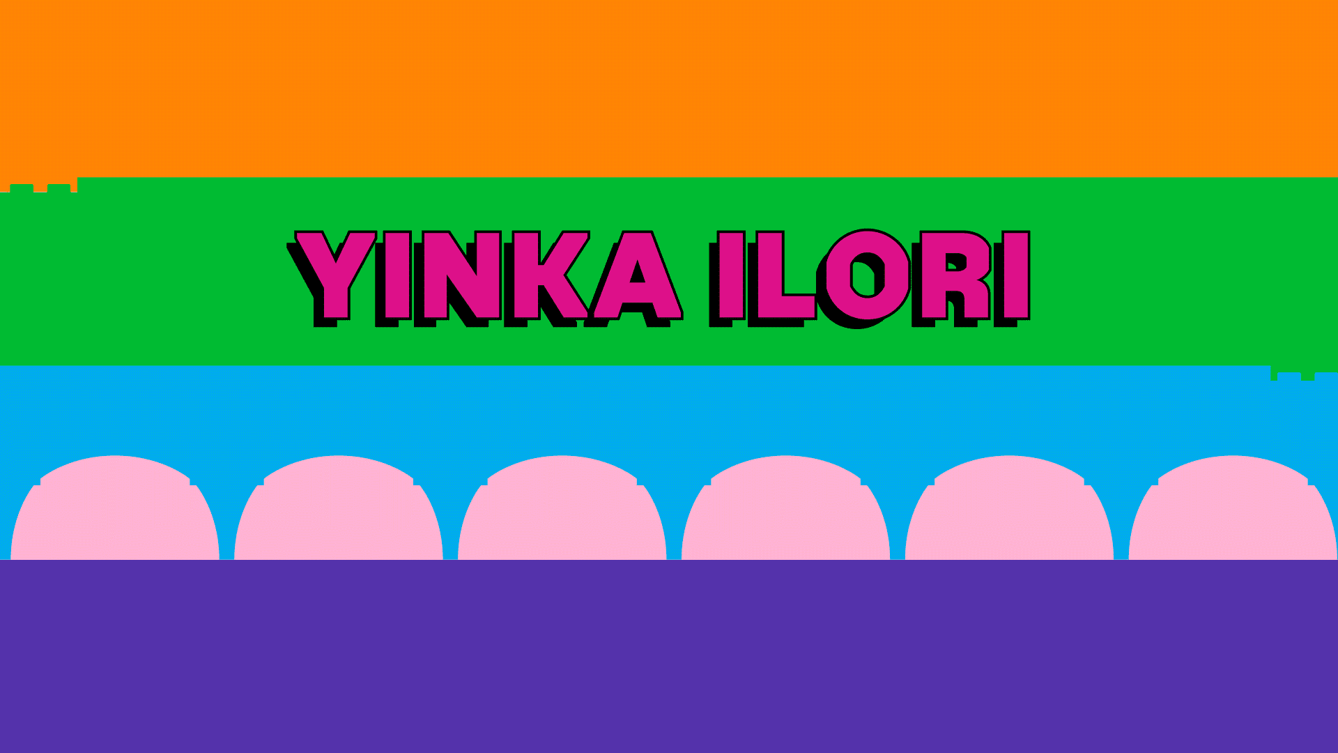
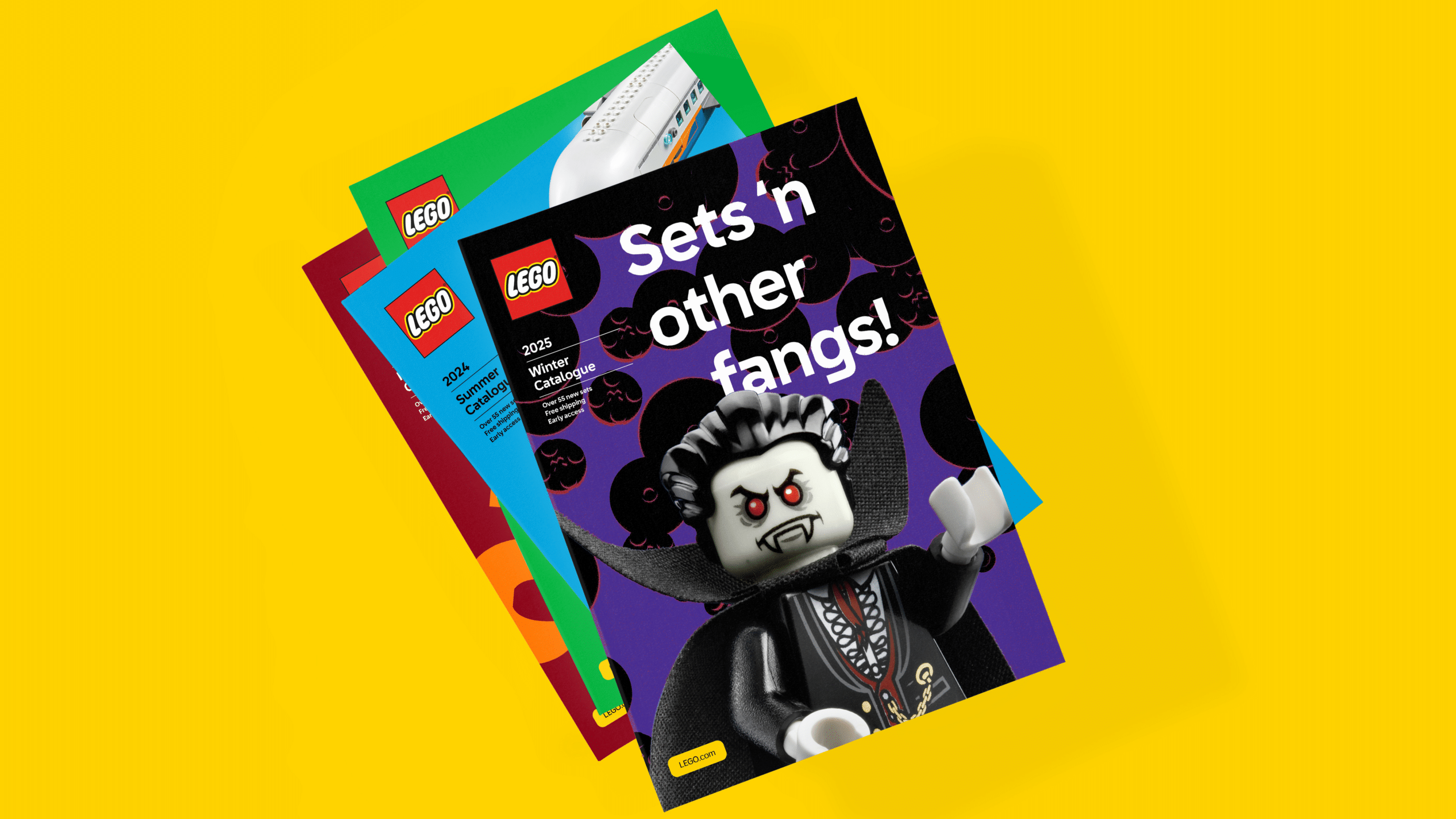
First things first, we created an official brick-inspired typeface in partnership with Colophon. Next, we developed a brick “clutch system” also in the form of a font, that allows anyone with a desktop to use. We simplified the brick to it’s graphic silhouette, consolidating the collection to 130 glyphs. With it, shapes, illustrations, and endless possibilities can be built—connecting the physical form to digital experiences. Action graphics introduce dynamics, drama and emotion into storytelling, while new motion principles reinforce the behavior of the brick across every touch-point. With this new visual identity now established, it’s only the beginning to what we can create…