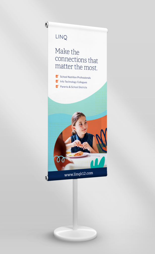
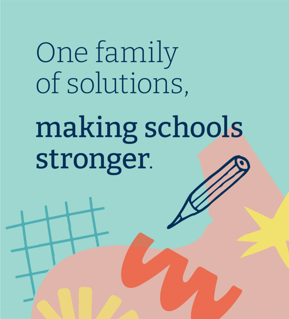
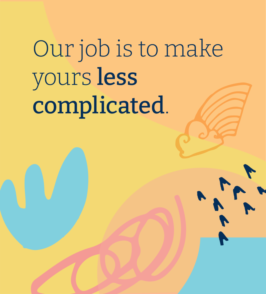
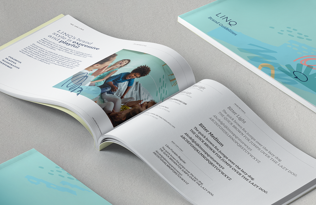
As Design Lead, I created the brand system to be expressive and playful. LINQ’s rebrand focuses on the lighted-hearted fun of primary K-12 education and the importance for connection. Organic shapes, doodle-like marks, and graphic textures are layered with photography to create ‘composites’ building a sense of unity and connection.
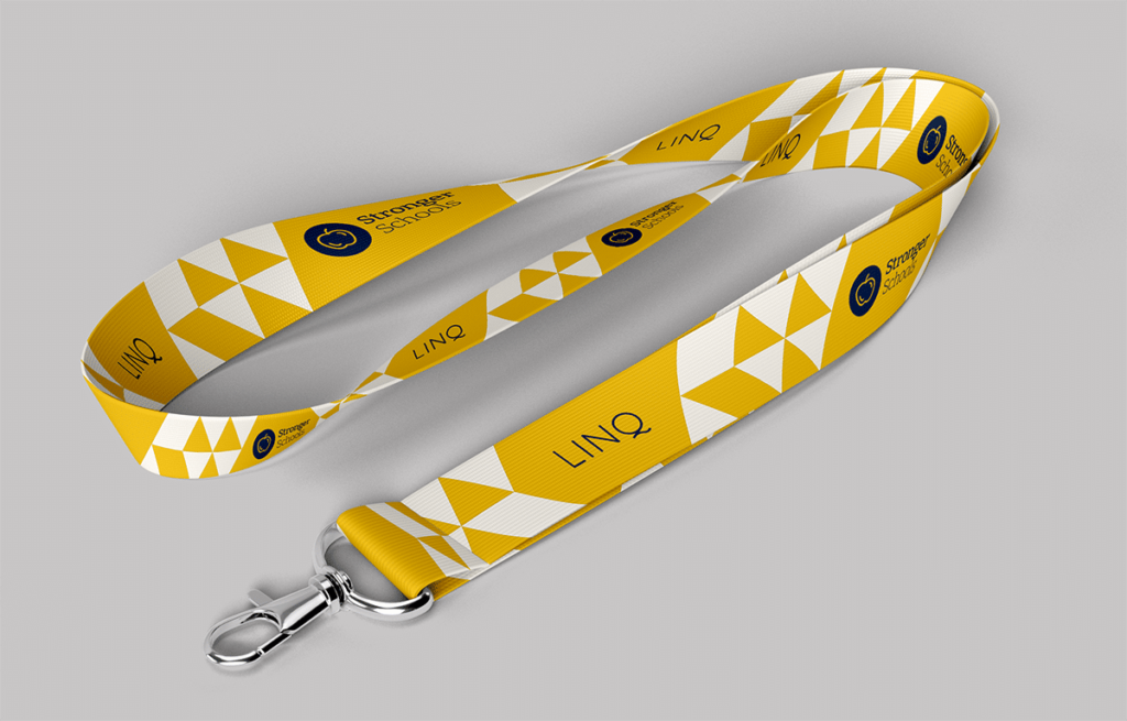
A bold color palette brings harmony and play to illustration elements and photo-illustration composites. The primary use of Midnight Navy adds a sophisticated tone to LINQ’s original artwork, aligning with the platform’s elevated brand. Graphic-only composites serve as abstract backgrounds to support key messaging. Since the rebrand launch, LINQ has acquired two additional companies, expanding its product portfolio.